Brooklyn Steppers
By the developing of the communication’s material for the Brooklyn Steppers Marching Band it was decisive that it communicated a modern, authentic, vibrant and unified visual experience in order to enable the band to gain more support and funding.
Role: Ideation | Research | Visual DesignerGoal
- Design visual identity to gain support and funding
Contribution
- Redesigned logo and communication products
- Applied visual identity in all band’s communication channels
Impact
- The fresh and energetic redesigned identity changed the perception not only of the brand but the organization as a whole; With the updated identity, band members and directors were very excited to start applying to get the much needed funding.
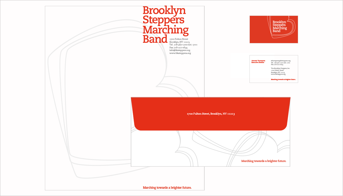
Process and Design
While briefing the director, the challenges such as the lack of congruence in their communications system appeared.
I presented the director with a plan of action where effort and time span of the project were outlined.
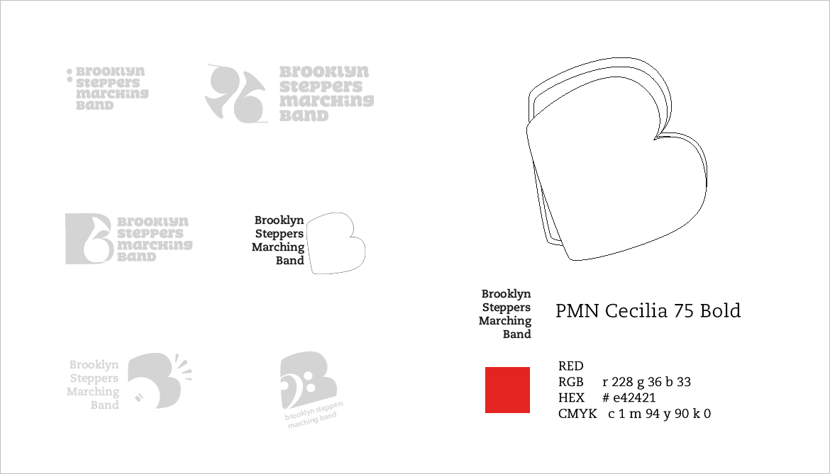
Several solutions were presented and we agreed on the vibrant, orange B with the name of the band in sturdy typographic style.
Application
The elegant slab Caecilia was choosen as the typeface, for its friendly and open quality, orange and the outlined B were applied to their communications system